Grocery Map Mobile App
Overview:
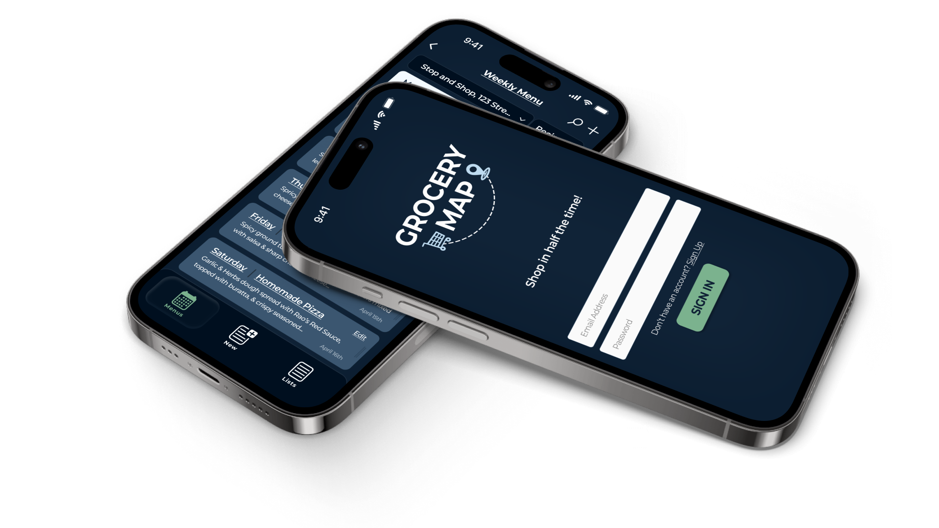
Grocery shopping shouldn’t have to be a long and stressful experience. However, with an ever-growing amount of stores to choose from, an overwhelming amount of items in each store, and people packed aisles, it can be a challenging task to grab everything you need from your shopping list in a reasonable amount of time. That’s why I designed a mobile app that organizes simple shopping lists itemized by where the items are located in each grocery store. Getting Shoppers in and out of the grocery store in record time!
Project Details:
CLIENT
Passion project for anyone who grocery shops
TIMELINE
2 Months
TEAM
1 Designer & 10 Survey Participants
MY ROLE
UX Researcher, UX Designer, & Illustrator
TOOLS
Figma, Illustrator, notepad
Challenge:
Ever since I took my first UX Bootcamp, I’ve been fascinated with learning about how mobile apps are designed and what makes the difference between a truly great design and a useless one. With that, I used my newly acquired skills to get started working on my passion project for my first case study.
Since the majority of people have their phones with them while they are out and about I decided that I wanted to create a mobile app that would make a user’s meal prep and grocery shopping experience easier and less time consuming. In order to understand what kind of app would help with that, I conducted some research on how user’s currently prep meals and shop for items at the grocery store.
UX RESEARCH
In order to figure out how to design an app that would help, I started off by surveying a small sample size of potential users with different backgrounds and shopping needs. I sent each user a list of questions that would help me paint a better picture of how they currently organize their meals and pick up their groceries.
UX FINDINGS
I quickly learned that the majority of users prepped their meals and went shopping on a weekly basis. Which I thought was important to note since that information will help estimate how often the app would likely be used. I also noticed that not a lot of users weren’t planning their lists or meals much before they’d head to the grocery store. I determined that life may often become too busy for most people to plan their meals out a head of time which likely leads to wasted time at the grocery store and unsatisfying meals throughout the week. To alleviate some of these issues, I set some goals in order to create a design that any adult could use to help save them some time at the grocery store.
Goals:
Save shoppers time.
Consolidate all aspects of meal prep in one place.
Help shoppers stay organized.
Problem Statement:
Shopper’s need a better way to create and organize their shopping lists on the go in order ease their experience any grocery store they shop at because prepping meals and shopping at a grocery store can be a stressful, time consuming experience.
Action Plan:
As apart of my competitor research I noticed that a lot of user’s preferred using their notepad app or an actual notepad to make their lists. Other shopping list apps such as AnyList or Out Of Milk used a simple look, but the UI felt very outdated. I knew that the design of Grocery Map needed to feel familiar, was easy to use and looked like new. I wanted the app to feel like it was a part of the shopping experience.